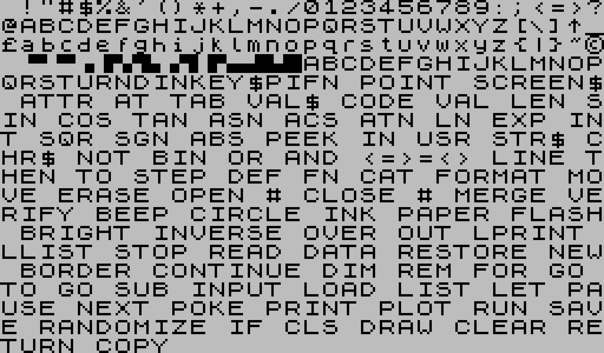
ZX Spectrum system font
Old computer fonts are fascinating. Making a consistent-looking font is a remarkable achievement in its own right, but designing a monospaced font that is readable on a very low-resolution screen, is aesthetically pleasing, and has a distinct personality — that's a whole other level of difficulty.
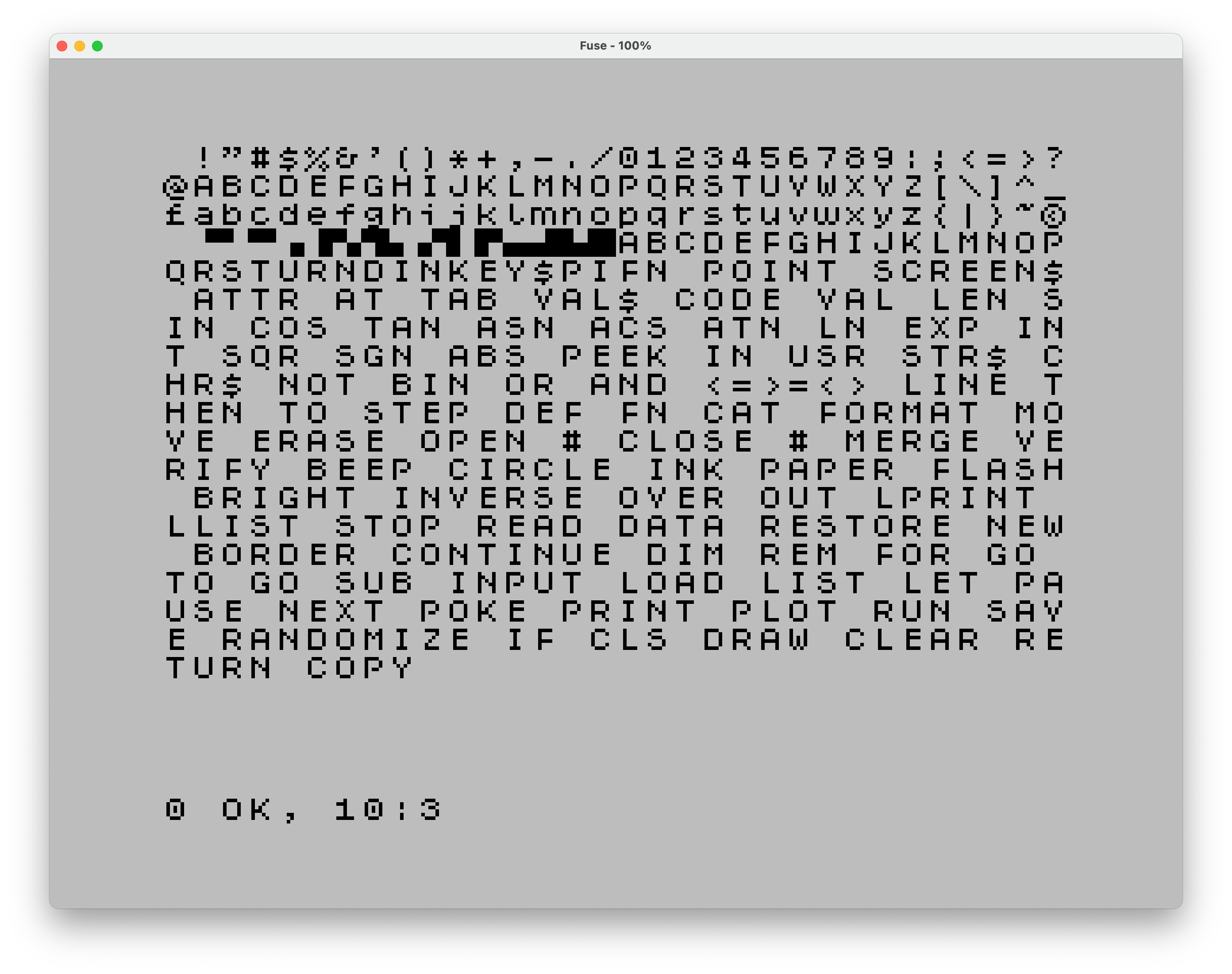
The ZX Spectrum system font is a nice example of this. It's an 8x8 pixel bitmap font used on the ZX Spectrum, a home computer released in the United Kingdom in 1982, and it's still recognized today (more than 40 years later!) as part of the machine's unique visual identity.
I mean, just look at it:
Sure, the font is a bit of a mess, but it's a charming mess.
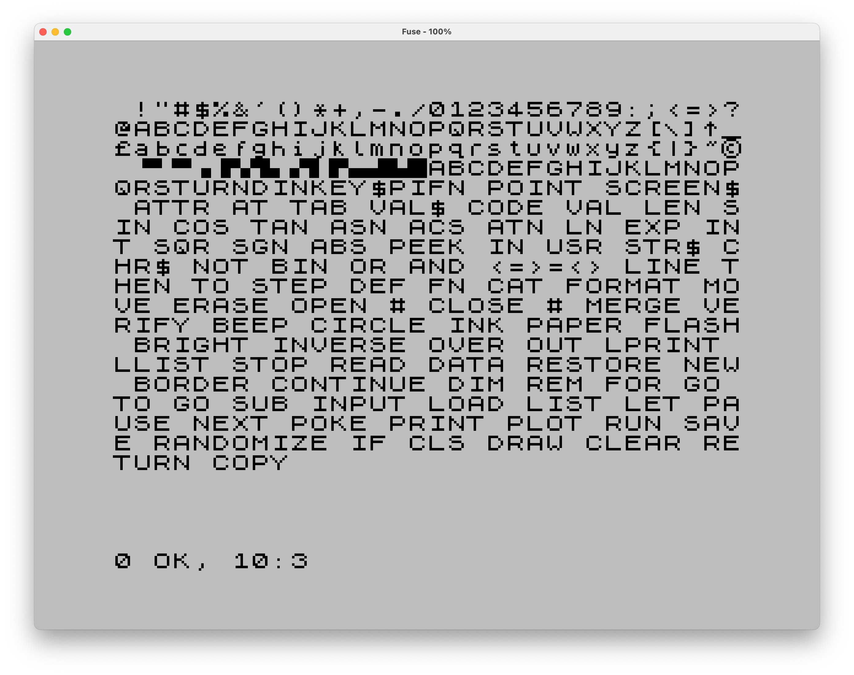
By the way, the screenshots in this post were made using Fuse, the Free Unix Spectrum Emulator. It's a delightful application, and I had a blast playing around with it.
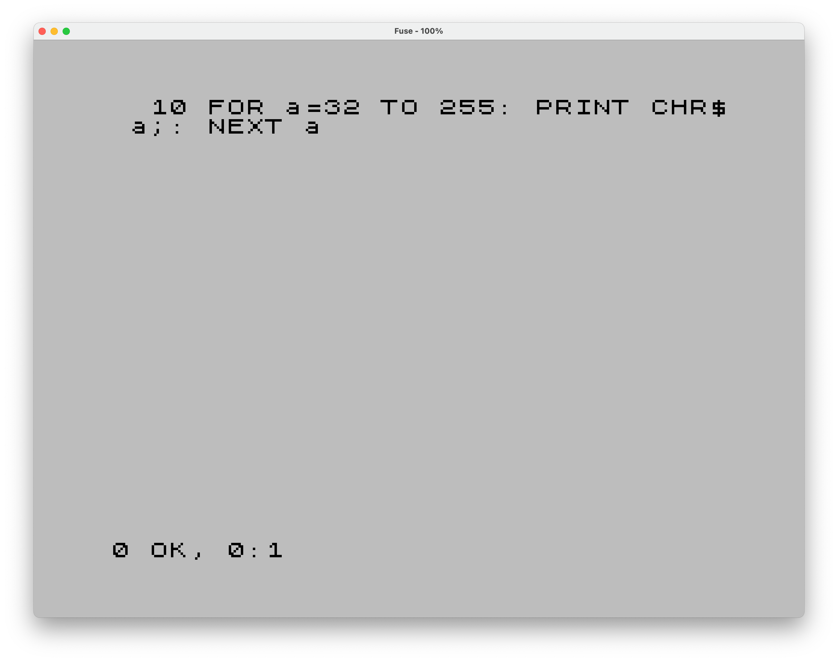
The Sinclair BASIC program producing the output above is as follows:
Typing this in on a regular keyboard was interesting: the BASIC keywords are their own code points, so pressing P while in keyword mode produces PRINT as a single character, R is RUN, and so on. Had to look some of them up, since I never remembered the ZX Spectrum's keyboard layout in the first place.
To better appreciate the original font design, compare it to a modern ZX Spectrum font, Clairsys, designed by Paul van der Laan in 2002:
Clairsys features less blocky letters, generally narrower than in the original font, and with larger counters. The letter spacing, as a result, is super wide.
And here's the same one-liner from before, typeset in Clairsys:

Dotted zero is a retribution for our collective sins. Other than that, I don't have any overarching conclusions for this post.
I'll try to make this into a series on pixel fonts. Let's see how that goes.